Here’s an overview of the home page and what you can access from there.
Many companies have been hesitant to trust their financial data – and that of their customers and vendors – to the internet, despite the fact that solution providers have built sophisticated security systems for this critical information. But you've decided that the benefits of online accounting far outweigh its slight risk, and you’re ready to start using QuickBooks Online in 2015. Whether you’re making the transition from a manual bookkeeping system or moving your operations over from desktop QuickBooks, you’ll likely be pleased with the site’s usability, rich feature set, and convenience – starting with a very effective, aesthetically-pleasing home page.

Figure 1: QuickBooks Online’s home page provides an overview of your company’s finances, including income, as pictured above.
One of the benefits of using online accounting is that it saves time. This is evident when you first sign into QuickBooks Online. You can immediately get a sense of your financial status from looking over the home page. Its individual elements include:
- A graphic that displays the total dollars that have been billed to customers, the amount that’s past due, and the total paid in the last 30 days.
- A chart showing where your money has gone in a given time period (categories and total dollar figures are displayed).
- Your profit and loss for a customizable date range.
- Account balances, and
- A list of your most recent activities on QuickBooks Online.
All of these data areas are interactive. That is, you can click on one to open a screen that displays details for each.
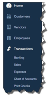
The left vertical pane of the home page is a navigational tool that takes you to the main screens of QuickBooks Online’s activity pages. Each has its own navigational tools that should be familiar if you've used any kind of software before.

Figure 2: This navigational tool helps you move quickly to QuickBooks Online’s task areas. Besides those pictured here, you’ll see Reports, Taxes, and Apps.
QuickBooks Online offers a navigational tool on the home page that is also carried over to other screens on the site. At the top of each screen is a kind of mini-toolbar that contains three icons:
- The magnifying glass opens the site’s Search Transactions tool and its Advanced Search.
- The “+” sign displays the Create window, which contains links to the transactions you can process for Customers and Vendors; to activities related to Employees; and to miscellaneous tasks like Transfers and Statements.
- The third icon, which looks something like a clock, opens a list of the most Recent Transactions.
Finally, in the upper right corner you’ll see a link to QuickBooks Online Help, and a small icon that looks like a gear. Clicking on the latter opens a window that displays your company name and links to four types of tools and data: Settings, Lists, Tools, and Your Company, as shown here:

Figure 3: Much of your setup and maintenance tools are accessible by clicking on the small gear icon in the upper right corner of QuickBooks Online.
You’ll click some of these links as you’re readying QuickBooks Online for use, to perform setup tasks like:
- Establishing your Company Settings. These used to be called Preferences, and they include specifying your accounting method, defining custom fields, and assigning accounts. The site is pre-populated with defaults, but you can change these.
- Creating records for your Products and Services.
- Working with your Payroll Settings, and
- Assigning access limits as you set up and Manage Users. If you have multiple employees using QuickBooks Online, you’ll want to specify what they can and can’t do.
Once you've prepared QuickBooks Online to meet your company’s specific data and workflow needs, you’ll occasionally want to get to these links to, for example, set up Recurring Transactions and Reconcile accounts.
We truly hope you’ll include us in your QuickBooks Online setup process. Although we can come in and troubleshoot when you have a problem, it’s much wiser to customize QuickBooks Online from the start.

